FEATURES
Macquarie launches a reinvigorated image
By reclaiming the past, Macquarie is heading in a new direction in its look and feel, while continuing to do what we do best: nurturing our students, staff and stakeholders to break free of tradition and embrace new directions.
The Shared Identity project is a strategic re-imagining of who we are, bringing the story of Macquarie to life, with a new outlook for our brand that reflects our unique heritage and the roadmaps for change being implemented in research and learning and teaching.
Because of their historical connections with the University’s namesake Governor Lachlan Macquarie and the powerful symbolism they evoke, the Macquarie Lighthouse and Sirius Star have been reinstated in University branding.
At the heart of all communications will be the theme identified by groups from across the university as uniquely Macquarie, namely that our university nurtures students, alumni and staff so that they are encouraged to break free to explore their driving passions.
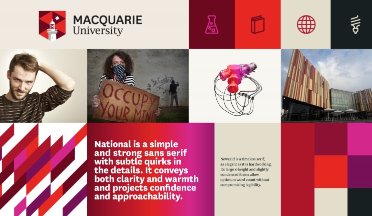
The reinvigorated brand will clearly differentiate Macquarie in a cluttered and homogeneous marketplace: Together with a new colour palette, contemporary typography and striking design elements this new, unified positioning will better reflect the University’s values and strategic priorities.
It will also underscore a proactive approach to changes in our sector that require a bolder, more disruptive presence in our increasingly competitive external environment.
“This University has had an incredibly strong identity from the start, as a different university when it was created over 50 years ago, but over recent years we have in some ways lost our capacity and capability to see ourselves as a complex dynamic whole in addition to being a set of innovative parts,” Vice-Chancellor Professor S Bruce Dowton said at a launch for university staff on 16 September.
“This project sits over all the University’s myriad other projects, and will provide the sense of what we aspire to and how that defines who we are, both now and in the long term.”
The work has been started in Macquarie’s Jubilee year to ensure that the University is well positioned to face the challenges, and seize the opportunities that arise in the next 50 years and beyond.
The project has grown out of the 2013 ‘Our University – a Framing of Futures‘ whitepaper, which outlined the broad strategic direction for Macquarie over the coming 10 years.
‘Our Shared Identity’ is one of the 21 projects identified in that strategic framework, and has the objective of reinvigorating the Macquarie University brand to ensure that it aligns with the strategic direction, vision, values and mission of the University – both in its visual form, and in the way we talk about ourselves to our many target audiences worldwide.
While the new identity will be officially launched to the public in January, 2015 you can expect to see it progressively introduced in alumni publications and at events in the coming months.
Hi, just wondering with regards the rebrand a couple of key things:
What is the overall, complete, cost? Particularly with the amount of materials MQ will need to reprint, redevelop and publish, signage, branded cars etc, etc, etc.
Where is the rebranding budget coming from?
What is the predicted return on investment of the rebrand? When will MQ’s return achieve parity with the outlay and how will that be quantified? Will that information be made public?
Where does the rebrand sit with the university’s stated sustainability position, particularly with regards the booklets, pens, t-shirts, stationary, cards, signage, branded materials of all kinds which will be scrapped and redeveloped? Will we be informed about the fate of those materials and will the uni try to have some sort of carbon credits, or equivalent, to ensure a sustainable fate for these items?
With regards materials out in the community, t-shirts, printed stuff, what is the university’s position on them still being out there? Will they need to be returned? Can they still be worn by uni partners?
Thanks a lot for the detail.
Dave Harrington.
Glad to see the lighthouse is back!
Thank goodness some common sense has prevailed and we have our lighthouse and star back, instead of that ridiculous emblem of lotus leaves (an environmental weed currently investing the Lake). But why have we not our gold and green colours back? Why are we persisting in crimsons?? Tell me it’s not because that colour is lucky in a certain Asian country…
Really glad to see the Lighthouse back in the reinvigorated image !
An ancestor of mine, Thomas Glover, was Gov Macquarie’s stonemason who built the original lighthouse as well as other surviving works at the Mint and Hyde Park barracks etc (also Glover House in Kent St). As an alumni, I am glad the university has re-established the link to the lighthouse.
Such a wise move to reinstate the “Macquarie” symbols that were so much a part of the university’s history.
They are proud symbols and recognisable to all who studied there over the last 50 years.
Congratulations and thank you!
I wrote to say how disappointedI was when the Lighthouse disappeared so congratulations on bringing it back
Good move to bring the lighthouse back.
I’m glad to see the lighthouse back too. It should never have been removed in the first place. A pox on vapid pontificators who have no sense of history, no confidence in our civilisation!
So very, very glad that sense has prevailed with the Lighthouse and ‘Sirius in chief’. It was a perfect choice originally – Macquarie Lighthouse shining light of knowledge into the darkness (as I understand it an absolutely distinctive emblem, the only other university in the world to use a lighthouse being Alexandria, which uses the ancient Pharos, which was/is nothing like Macquarie Lighthouse in appearance), and Sirius, not only the brightest star in the sky, another symbol of the light of knowledge, but the name of the flagship of the ‘First [invasion] Fleet’. My Macquarie University ring, which I wear almost all the time, is once more comprehensible to viewer, and no longer suspected of indicating membership of some arcane cult .
Yay! I had written previously bemoaning the loss of this strong branding to no avail.
Glad to see it return.
Next: MU’s Chaucer quote?
“And gladly wolde he lerne, and gladly teche.”
Bring back the ORIGINAL Lighthouse!
i am so pleased to see the lighthouse come back. It was unique to Macquarie and was easily recognizable. The “gumleaves” could have been anything and always had to be explained to those who did not know. I do hope I am correct in calling them gumleaves. Common sense is a wonderful thing.
Great news – I was sad to see it go!
Absolutely ridiculous! The original coat of arms was perfectly fine – why waste precious money changing it twice! You don’t see Sydney or UNSW or ANU fiddling with their “branding”. It shows a university that doesn’t know what it is. As alumni, I’m very disappointed in “my” university.
I agree absolutely with Sofie and the others who call for the restoration of the original arms and the original colours. These two recent “re-brandings” seem to have come from the fevered dreams of advertising gurus. Macquarie is a UNIVERSITY for heaven’s sake, not a brand of biscuits.
I too am glad to see the return of the Lighthouse, but I’ll go further. The University has had an image fixation the last few decades or so—–it has been the Lighthouse to arches to poker hand back to the Lighthouse; rather like the architechtural and interior changes to pubs over the decades to lure more clients. But Macquarie is different—it’s a university………………………………..wait a minute!
On my degree is the said lighthouse on a dark green (not red and maroon) background with touches of gold. It was simple and effective. I don’t know why that image had to be abandoned, as its simplicity made it universal and timeless. Sydney University has no such trouble with its crest, little changed over 160 or so years—talk to it about tradition and the like.
I think Macquarie needs to cultivate a sense of tradition and the best way of doing that is to keep the Lighthouse in its original form for all uses.
Thank you for the opportunity to comment.
John.
Hi John,
Thanks for sharing your thoughts about the University’s reinvigorated image. We appreciate your feedback and are pleased to hear that the lighthouse has been welcomed back by many alumni.
Consultation with a range of stakeholders including alumni, students and staff found that the University’s visual identity, including its logo, needed repositioning in order to better capture Macquarie’s unique heritage, distinctive traditions and future ambitions in learning, teaching and research discovery.
It was decided to retain the use of a predominately red colour palette with the addition of purple and magenta to add vibrancy. Red has been a dominant feature of Macquarie’s identity for over a decade. This colour palette is also unique amongst our Sydney competitors. The University saw an opportunity to consolidate on the use of these colours to build further recognition in what is currently a distinctive colour selection.
Regards
Martine Balit
Alumni Relations
Vibrancy, rubbish. Leave red to fast food outlets. Where are green and gold in other University arms or badges?
Restore “and gladly teche” also. That would really “capture Macquarie’s unique heritage”.
I also feel very strongly that the motto “And gladly teche” should be returned. I was always very proud of Macquarie’s original coat of arms and motto and I’m very disappointed that the university wasn’t also proud of its unique heritage. I don’t think it should ever have changed. “Rebranding” is not for universities, particularly ones who know who they are. Macquarie can’t ever compete with the Group of 8 simply by changing its coat of arms. Rather, it needs to look at its research funding priorities to make itself a serious competitor with the other Sydney universities.
I am absolutely delighted to see the lighthouse back. Lighthouses spread light which should also be the ultimate goal of a university. To enlighten through the spread of knowledge, To remove darkness due to ignorance – this is what my great university, Macquarie, is all about. Congratulations.
R. M. Sloman BA(Hons), PhD.
Back to the future. How unfortunate that the lighthouse, nostalgic as it is, is a symbol for outdated technology. The description and rationale above is so pretentious as to be laughable. Pure marketing hype to justify what will be an expensive exercise in rebadging, using money better spent on research or improving our teaching technology and skills.
The lighthouse was a unique symbol of Macquarie Uni, connecting it to its namesake. I was very disappointed when it was discarded. So pleased it it will be back again!
The design and color of the new light house is better than the original one, and much better than current logo. I am happy with the new logo.
Hoorah for the return of the lighthouse – a beacon for the uni’s history and character.
Thanks for sharing your thoughts about the University’s reinvigorated image. We appreciate hearing from you all and are pleased to hear that the lighthouse has been welcomed back by many alumni.
Regards,
Martine Balit
Alumni Relations
I too am very pleased to see the return of the lighthouse, so much more distinctive than the lotus leaves or whatever those nondescript petals were. However I do wonder why the colour green had to be abandoned, and whatever happened to “….. and gladly teche”.
Good to see the lighthouse back where it should be. New colours are great, never liked the green. Now a confession – I do not like the Australian colours green and yellow either (I know – it is supposed to be gold!!!). – I must have a problem with green Well done all. Why not complete the badge by reintroducing the “and gladly teche”
Delighted to see the lighthouse back. As a 1968 student it means a lot to me.
The more things change, the more they stay the same! I’m very glad to see the lighthouse return, but I concurr with Judy Crewe entirely. Besides, from a marketing perspective, I was always taught that black on a yellow background was most effective. Red tends to be associated with emergencies and emergency services
I am very glad to see the return of ‘THE LIGHTHOUSE also.
I believe though It needs, to be a symbolic physical structure (illuminated), erected on the campus, visible for the many students and faculty to see, as all look for guidance and inspiration in their individual pursuit of knowledge, often looking into the abstractness of their mind for inspirational direction.
Researchers and students, creating ‘New’ ideas and improving on existing knowledge, inspires greatness within us all. This University (Macquarie), needs to be known for its ability to inspire greatness within its walls, down through the decades ahead.
As the Vice Chancellor has stated we are but trustees for future generations of students who will be proud to say ‘I studied at Macquarie’ . It was my first choice.
I think Alumni Relations was handed a nasty job in trying to explain the new logo.
At least it was not described as a coat-of-arms.
I wonder where this gem came from “It was decided to retain the use of a predominately red colour palette with the addition of purple and magenta to add vibrancy. Red has been a dominant feature of Macquarie’s identity for over a decade.” Really?
The four testamurs on display in our house have the proud green, white and gold arms and motto of a fine University. Fifty years is not a long heritage, but it’s well worth celebrating the refreshing university that began in the 1960′s
If we can’t celebrate those 50 years without some cultural cringe, where will we be come the centenary? …still trying to wriggle into some other cultural mould?
It’s ludicrous and shameful that our testamurs, of which my family is proud, do not have the same arms and motto as the “fast food branding” of the University as a whole.
It’s time to stop pretending that change for change’s sake somehow improves our university standing, desirability, credibility or anything else! Cut the caffeine excitement and restore the heritage – out with the cringe!